Atoms
Atoms are the smallest reusable building blocks of a user interface. They represent a single responsibility and cannot be meaningfully broken down into smaller UI components. Examples include buttons, labels, icons, input fields, checkboxes, and headings.
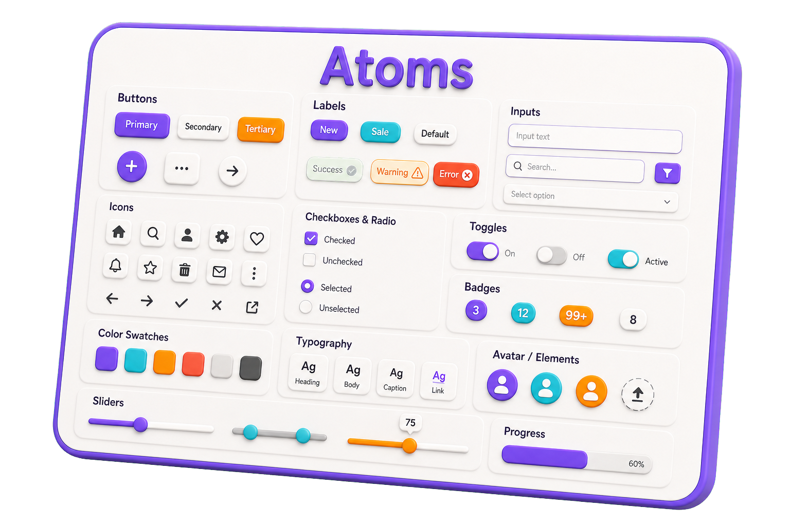
Rules for Atoms
- Have a single, clear purpose.
- Contain no business logic.
- Be highly reusable across the application.
- Accept data through props and emit events when needed.
- Avoid dependencies on other application-specific components.
- Be independently testable and documented.
- Focus on presentation and interaction only.
Label atom example
import type { LabelInterface } from './Label.interface'
import { LabelTypes } from '@/components/_types_'

const Label = ({ testID, text, type }: LabelInterface) => {
  return (
    <div data-testid={testID}
         data-object-type={type ?? LabelTypes.DEFAULT}
         className={`Label`}>
      {text}
    </div>
  )
}

export default Label